


The YouTube layout that is awesome to us and that is not great to us. Let's get started with YouTube 3.0 Channel Layout.


Old New
Pros
Our previous layout was not loading our comments up and it keeps deleting our comments once we copy entire people's comment. right now we have third youtube layout that doesn't delete our comments for coping entire people's comment. but most of the time it doesn't load up when you posted a comment you have to refresh it it still doesn't show your comment you have to wait in 22 minutes.
back in december 2011 we can't load the comments up people didn't like that it was partner friendly back then it goes back till user friendly till may 2012. people are glad it is back to be social able again. people are still not coming back because the layout.
It was on the featured side and it was on the left Now you have the comments are not the featured side and the left. The comment box is on the top once you click "comments" It is easier to post comments now.
Cons
Many people didn't like the layout dull the previous channel wasn't dull. it does look boring when it's dull. you can't use the transparency or themes.
In the previous layout you can see there is video info. the new one you have to click to go on the video page.
Less "about you" information
People had been angry about the describe box (I'm talking about describe yourself box")
it is 1,000 characters. In the previous layout you have more than 1,000 characters I don't know how much in the previous layout.
In the previous layout we don't have partner friendly. in the current layout we don't have modules that are user friendly.
YouTube Channel Design 2.0
Pros
it is more organized than the current one we have you got all of your information and you have more freedom.
In YouTube channel layout 1.0 it looks old fashion like myspace that has 1.0 and probably we can say the youtube channel layout 3.0 is old fashion.
We can choose themes and color our themes to make it look better and we can use the transparency to make it look more clear. we can upload our background to make the channel look better it does not make your channel look boring.
Cons
We remember half three years ago youtube cleaned the bugs since it is almost time to switch the youtube channel 2.0 a few glitches in the display and load time on various browsers. people tried to customized their channel to view videos as grid or featured they had an problem.
Spoilers
spoilers means things has not occurred outside of youtube yet.
This could be upcoming layout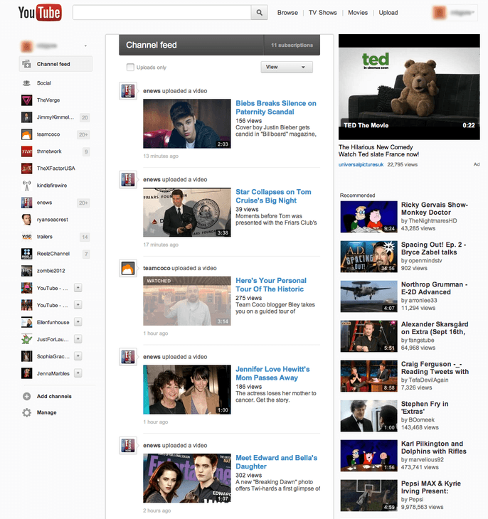
It doesn't look gray. If google tells youtube to create an new layout. It could be user friendly again but not entirely. It could bring back the modules from the beta channel. we could able to color our channels and transparency again and more describe yourself character limit not less. it hasn't been confirmed yet that will be a new youtube homepage or new channel layout. google or youtube said bringing the new homepage. we could have the new homepage till july or september. I don't know youtube will get rid the black header on the channel layout. keep checking on the youtube updates on youtube's blog!.
Old New
Pros
- Comment system
Our previous layout was not loading our comments up and it keeps deleting our comments once we copy entire people's comment. right now we have third youtube layout that doesn't delete our comments for coping entire people's comment. but most of the time it doesn't load up when you posted a comment you have to refresh it it still doesn't show your comment you have to wait in 22 minutes.
- Back to be social-able
back in december 2011 we can't load the comments up people didn't like that it was partner friendly back then it goes back till user friendly till may 2012. people are glad it is back to be social able again. people are still not coming back because the layout.
- Moving of comment box
It was on the featured side and it was on the left Now you have the comments are not the featured side and the left. The comment box is on the top once you click "comments" It is easier to post comments now.
Cons
- Layout is too dull
Many people didn't like the layout dull the previous channel wasn't dull. it does look boring when it's dull. you can't use the transparency or themes.
- Can't see video information
In the previous layout you can see there is video info. the new one you have to click to go on the video page.
People had been angry about the describe box (I'm talking about describe yourself box")
it is 1,000 characters. In the previous layout you have more than 1,000 characters I don't know how much in the previous layout.
- Partner friendly
In the previous layout we don't have partner friendly. in the current layout we don't have modules that are user friendly.
YouTube Channel Design 2.0
Pros
- organization
it is more organized than the current one we have you got all of your information and you have more freedom.
- Watching an video on a channel
- Modern Look
In YouTube channel layout 1.0 it looks old fashion like myspace that has 1.0 and probably we can say the youtube channel layout 3.0 is old fashion.
- Themes & transparency & more
We can choose themes and color our themes to make it look better and we can use the transparency to make it look more clear. we can upload our background to make the channel look better it does not make your channel look boring.
Cons
- Comment system
- Bugs
We remember half three years ago youtube cleaned the bugs since it is almost time to switch the youtube channel 2.0 a few glitches in the display and load time on various browsers. people tried to customized their channel to view videos as grid or featured they had an problem.
Spoilers
spoilers means things has not occurred outside of youtube yet.
This could be upcoming layout
It doesn't look gray. If google tells youtube to create an new layout. It could be user friendly again but not entirely. It could bring back the modules from the beta channel. we could able to color our channels and transparency again and more describe yourself character limit not less. it hasn't been confirmed yet that will be a new youtube homepage or new channel layout. google or youtube said bringing the new homepage. we could have the new homepage till july or september. I don't know youtube will get rid the black header on the channel layout. keep checking on the youtube updates on youtube's blog!.


